Behind the Scenes of the Champion Bottle Series
Based in Charlottesville, Virginia, Champion Brewing Company decided to release a limited run bottle series. Each label spotlights a fantastical scene that reflects the character of the beer within. But where are we generating our ideas from and how is Watermark executing each label?
THE PROCESS BEHIND THE LABEL:
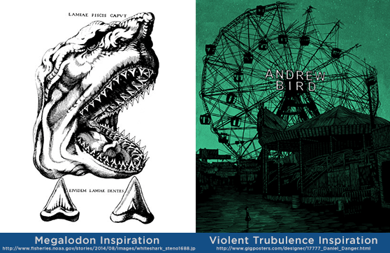
1. Inspiration. As artists, we utilize our education in art history to reference the styles that might relate to the concept that Champion brings forward. They always have a clear vision of the direction they want to head, and we are lucky enough to get to bring that to life.
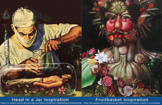
In this series we have referenced the work of Renaissance painter Giuseppe Arcimboldo, pulp comic book covers from the 1950’s, and father of modern geology turned bishop Nicolas Steno as a contextual underpainting and starting points in our illustrations. Before any label is actually sketched, time is invested into creating a rich background for each label so that multiple angles and scenarios can be considered for the final round.
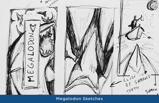
2. Sketches. With research well underway, we next dive into a series of sketches for each concept. These roughs block action, perspective, and the rough idea behind how the label will function in the final draft. Once pulled into the computer, it is much more difficult to change individual pieces of the illustration because the time has been invested to draw a specific angle and detail of an object. The sketching stage is crucial for picking appropriate reference imagery and deftly applying it to stage a scene. One of the most important skill sets in design (and one of its practical features within fine art) is working under pressure and with a constantly running clock for the client. After several scenes have been blocked, we choose one direction with Champion, and then move forward to the actual illustration.
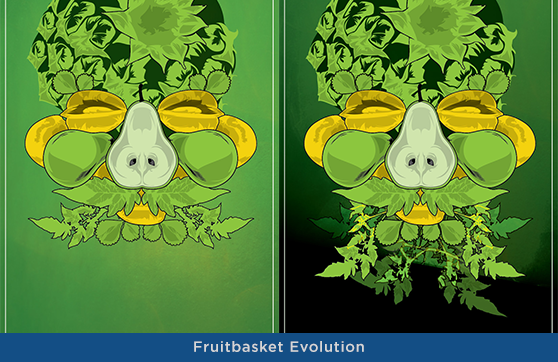
3. Foreground Image. In the Champion bottle series, the brand approach always features a single object, usually at an extreme angle, digitally rendered in the foreground. It is at this stage that we also decide what the monochromatic (single-color) set is going to be for the label and solidify our reference imagery. In Fruitbasket, we pulled from a library of images from Arcimboldo, the former court portraitist of the Holy Roman Emperor Ferdinand I, who is better contemporarily known for his bizarre still life portraiture (Vertumnus, seen above in the “Fruitbasket Inspiration”). His works, particularly The Librarian, were utilized as a form of social commentary and criticism for their subject, in which objects were chosen based on how they would decay over time or how lavish they were. Similar thematic elements were later utilized in Flemish Baroque painting, such as De Heem’s Table.
Each fruit was individually chosen for which facial feature it would most closely resemble, and then digitally drawn. Shadowing is then applied, placement is considered as the fruits build up around one another, and vines wind around the face to form the illusion of a beard and hair. In this specific instance, a yellow color palette was initially considered, so the digital sketch still features yellow fruits. A pineapple was initially chosen for the forehead of the figure, but became less legible as the rest of the illustration took form, so it was switched out.
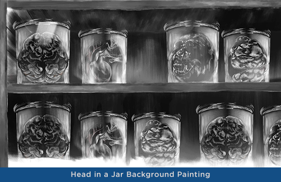
4. Background Painting. The next stage of the Champion bottle series is the digital painting laid behind the foreground image. Tints and shades of the primary color create a hazy scrim of objects or scenery that are digitally rendered as if from oil paint, acrylic, or gouache depending on the label. Violent Trubulence, for instance, has a much rougher painting technique than the soft heaps of watermelons in the background of Fruitbasket or the specimen jars in the background of Head in a Jar (pictured here in detail).
5. Creating a Scene with a Splash. We’re very proud of the designs for Champion Brewing Company’s new bottle series and are excited to continue developing more! Keep in touch, and check out this feature on the bottle designs on Packaging of the World!
 Check out the full project here!