The evolution of a brand
Satan’s Pony
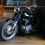
A brand can evolve over time due to a number of factors; often the need to stay relevant in the market and times; but changes in ownership can also drive change. South Street Brewery is one of Charlottesville, Virginia’s oldest craft breweries. The original owners’ aesthetic was consistent with the older brick building it is housed in, with original wood beams and floors, and a darker, cozy atmosphere. When they approached us with the idea of going to market with their beer and needing package/label design, they envisioned a vintage look that reflected the motorcycle that is the namesake of one of their most popular flagship beers – Satan’s Pony.
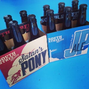
And so, the original packaging that brought them to market was born:
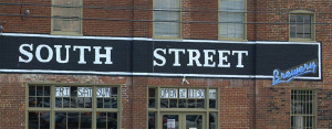
The logo design remained consistent with the original signage on the building:
But we also designed a secondary mark that could be used in the branding:
THE REBIRTH:
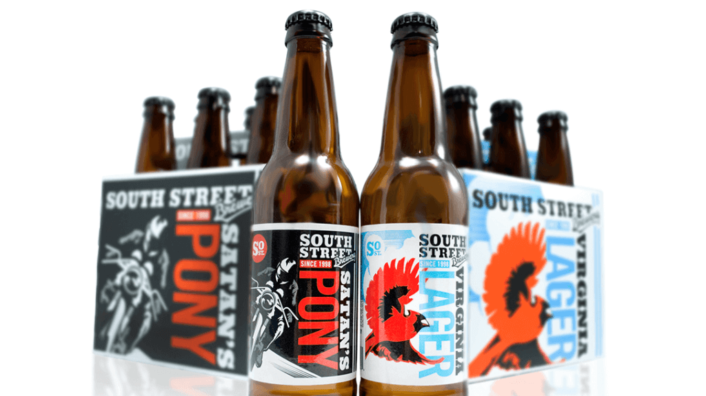
In 2014, we were notified by another client of ours, Blue Mountain Brewery (new website coming soon!), that they would be purchasing South Street. The owners of Blue Mountain had a different vision for South Street – a brighter, more modern brand – while still respecting the history of this Charlottesville landmark. Taylor Smack, one of the owners at Blue Mountain and now South Street, was actually one of the original brewers at South Street, so this is a homecoming for him. Re-opening in late fall 2014, the refreshed brewpub will feature an updated look, menu, as well as some new beers. With this revision on the brand came new packaging as well, maintaining the logo design for consistency. The new color palette is vibrant and stands out on shelf: