Afton Mountain Vineyards Wine Label Refresh
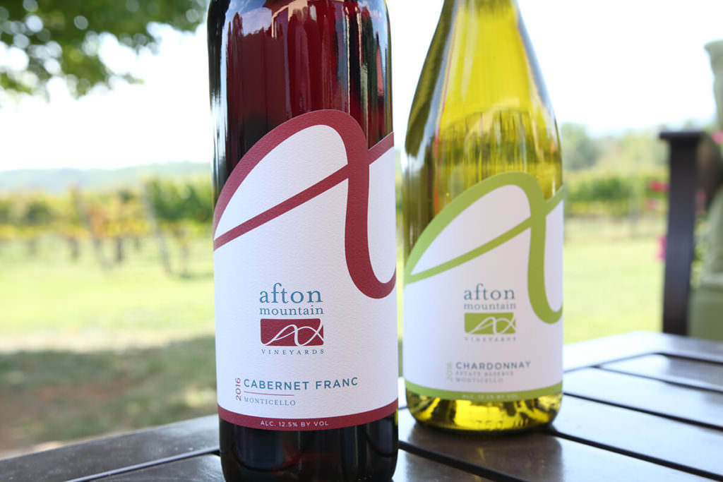
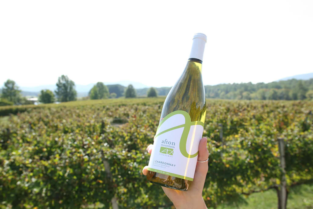
Afton Mountain Vineyards was our first Virginia wine label design, originally created in 2009. This year, after nearly a decade working together, we refreshed their label design. The die cut follows the lines of their logo design and maintains their color palette, to reinforce brand recognition, while presenting a new, fresh and modern package design. The label flows around the bottle, forming in a valley in the back, after the peaks on the front, which abstractly reference their skyline view of the Blue Ridge Mountains.